Backgrounds.
Grids, glows, meshes, stars, rings, waves, and images that stack behind any section, edge to edge or inside the content area.
Backgrounds stack
Layer backgrounds to build your own look. Here drifting corner glows sit over scattered squares, and hold still for visitors who prefer less motion.
Light in the dark
A beam falling through a field of stars. Try it in dark mode, where the stars shine brightest.
Grain makes color feel real
Grain laid over a mesh smooths out banding and gives the color a printed, tactile finish.
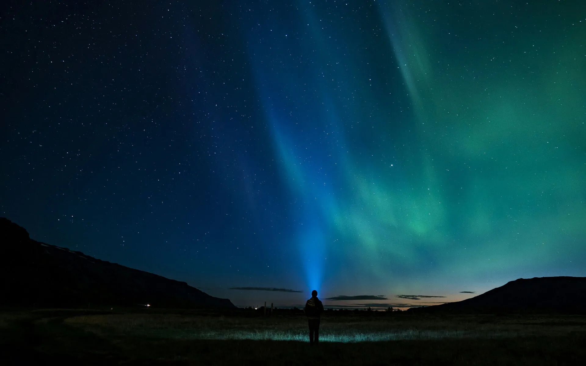
Your own photo behind the words
Any image, tinted with the page color so the headline stays easy to read. This section is set to dark mode on its own, whatever the rest of the page uses.

A picture that sets the mood
Kept inside the content area, a lighter tint lets more of the image show through. Go softer or stronger to match the photo.
Color that drifts overhead
Soft washes of your brand and accent colors float along the top of the section, slowly shifting shape. They hold still for visitors who prefer less motion.
A floor that runs to the horizon
The grid tilts back and meets the horizon behind the headline, rolling slowly toward you. It holds still for visitors who prefer less motion.
Room to grow
A higher horizon and tighter cells stretch the floor across the whole section, with the card floating above it.
Color from every corner
Several soft pools of color meet in the middle. Pick your brand tones, a warmer spread, or a quiet gray.
A warmer spread of color
The accent colors take the lead here, with your brand color tucked into one corner.
A spotlight on the headline
One cone of light falls from the top edge, right where the title sits. Keep it wide and gentle, or narrow it to a sharp beam.
A clear night sky
Specks of light scattered from a seed, with a few that twinkle. Change the seed for a new sky, and it looks the same on every visit.
Ripples from the center
Circles spread out from behind the card, with a slow pulse that draws attention to the offer. Start them from the top or bottom edge instead.
Signals from above
The same rings, rising from the top edge and spaced wider apart for a calmer rhythm.
A pulse from below
The same rings, rising from the bottom edge to lift the headline and lead the eye up to the button.
A gentle tide at the edge
Layered waves roll along the bottom of the section, each at its own pace. Anchor them to the top instead to ease in from above.
Every brand has its own terrain
Contour lines like a hiking map, drawn from a seed. Change the seed for a new landscape, and it looks the same on every visit.
Warmth from the corner
Your brand color blends into a warm tone from one corner to the other, for a banner that feels lively without getting loud.
A wash of color from above
Your brand color pours in from one edge and melts away. Point it in any direction and pick a calmer or more colorful tone.
A quiet wash from below
A soft gray tint for brands that save their color for the buttons. It rises from the bottom here, and it can come from any side.
Light from the corners
Two soft glows in your brand color frame the section from opposite corners. Add a slow drift for a touch of life, like the stacked example at the top of the page.
Blocks with a bit of character
A grid with scattered squares filled in, like a pixel mosaic. Make the squares bigger or smaller, and fill in as few or as many as you like.
A pattern of your own
Shuffle the squares until the arrangement feels right. Once you pick one, it stays exactly the same every time the page loads.
Built on a steady frame
A triangular grid that hints at structure and scale, for products that run the infrastructure underneath.
A frame of fine lines
Cleared from the middle, the grid holds to the edges and leaves the headline in open space.
A clean grid for structure
Fine lines that give a section a precise, engineered feel. Choose tighter or wider spacing, and let the edges fade softly into the page.
Marks on engineering paper
Small crosses set on a grid, one landing right in the middle. Lighter than a full grid, with the same sense of precision.
Stripes that lead the eye
Vertical lines stretched, fading toward the sides so the card stays the focus.
Fine lines at an angle
Evenly spaced strokes that give a section a drafted, technical feel. Run them across, down, or on the diagonal.
Texture that frames a card
Stretched across the full width, looser dots set the card apart from the rest of the page.
Dots for gentle texture. A quiet pattern that adds depth without pulling focus from the message.
A little grain goes a long way
A fine film grain that turns flat color into something you could almost touch. It shines most layered over a gradient or a glow.
A calm panel of color
A soft, tinted surface that sets a section apart from the page around it. Add a thin line along any edge to mark where it begins or ends.